EAPOC Logo (2025)
Client: Samir Gupta, MD
Brief Description: The logo for EAPOC(Evidence at the Point of Care) creatively integrates the brand’s core identity into a visually symbolic design. The letter "E" is transformed into a stethoscope, with its shaft extending toward a target icon, representing the concept of point-of-care. To reinforce the stethoscope motif, earpieces are subtly incorporated. The thickness of the "E" evoke the image of a book, underscoring the theme of clinical evidence.

Main Concept

Variation 1

Variation 2
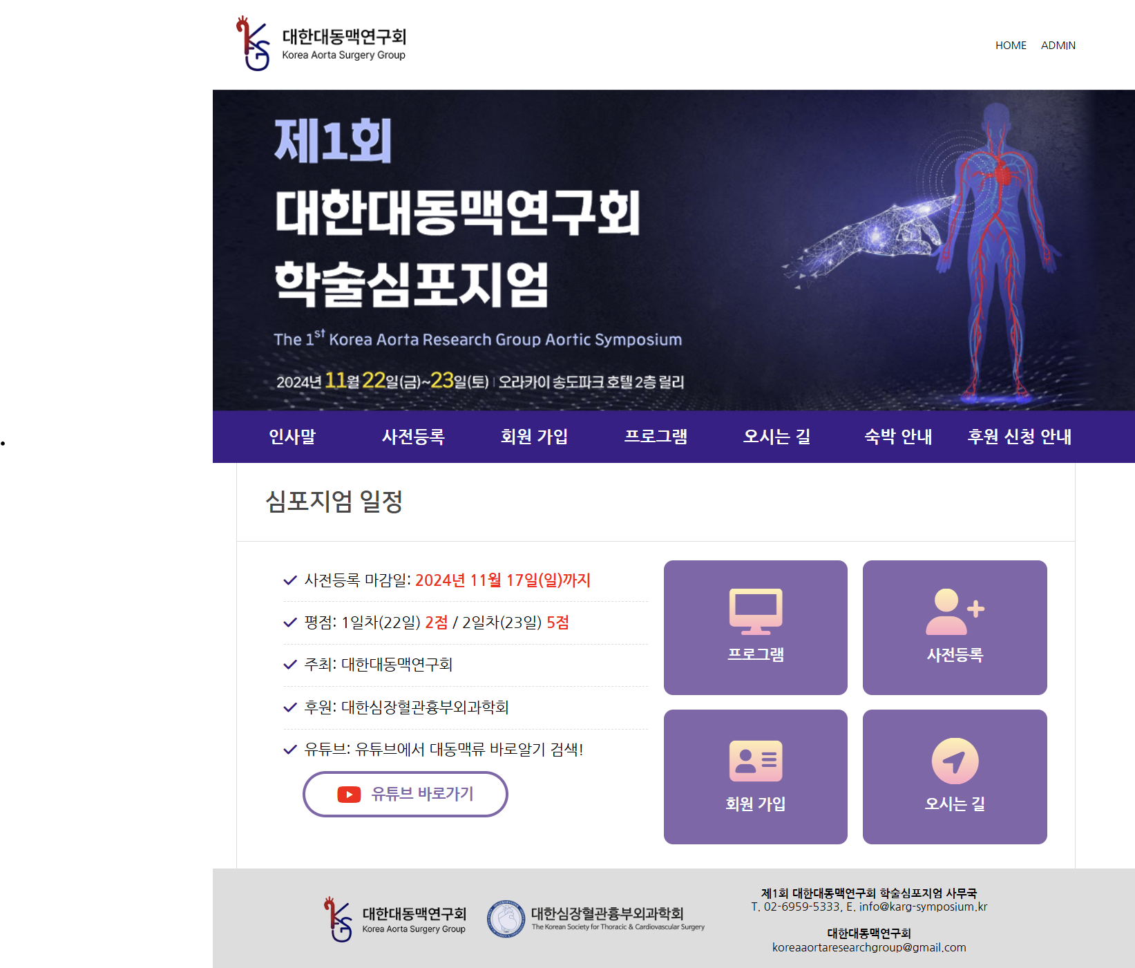
Korea Aorta Surgery Group Logo (2023)
[KASG website link] 대한대동맥연구회

KASG logo design